Between a returned letter marked NPAI and a correctly delivered one, the difference sometimes comes down to a simple readable label on the mailbox. Creating a free printable mailbox label at home requires neither expensive software nor graphic skills, but some technical choices directly affect its durability and compliance.
AFNOR Standards and Readability: What Your Label Must Comply With
The blocks of collective mailboxes installed in buildings are governed by AFNOR standards, particularly NF D 27-404. These standards require a nameplate of minimum dimensions and sufficient readability to allow identification by the mail carrier.
No law formally obliges an individual to display their name on their mailbox. However, La Poste’s general conditions specify that the absence of personal data may relieve it of its delivery obligation. In a collective building, an anonymous mailbox is considered “non-deliverable”.
This point changes the perspective on label creation: a fanciful or too small label, even if aesthetically pleasing, can lead to NPAI returns. Knowing how to make a free mailbox label therefore first involves adhering to these format and readability constraints.
Comparison of Free Online Tools to Create a Mailbox Label
Several platforms offer a free editor to customize and print a label. Their features differ significantly.
| Tool | Default Format | Number of Lines | Add Number / Floor | Font and Color Choices | Free PDF Export |
|---|---|---|---|---|---|
| Parchance.fr | 100 x 25 mm | 1 or 2 | Yes (left or right) | Yes | Yes |
| Canva | 93 x 25 mm (adjustable) | Free | Non-native (manual addition) | Yes (wide choice) | Yes |
| Plaquerapide.fr | 100 x 25 mm | 2 | Yes (bottom left/right) | Yes | Yes (sticker) / paid (PVC) |
Parchance.fr remains the most straightforward option for those looking for a blank model to fill out without distraction. Canva offers more graphic freedom, but adding an apartment number requires an extra step. Plaquerapide.fr combines a free editor for paper printing and an ordering option in PVC for those who want a durable plaque.

Paper, Adhesive, or Plastic: What Material to Print at Home
The choice of material determines the longevity of the label. Printing on standard paper works, but a paper label exposed to moisture degrades within weeks.
- Self-adhesive paper (A4 size in adhesive sheets, available at stationery stores) allows you to stick the label directly on the mailbox. Prefer a sufficiently dense weight to limit creasing.
- Transparent self-adhesive plastic film applied over a paper label adds a layer of protection against rain and UV rays. This solution remains the most accessible for a durable result without investment.
- Printable adhesive vinyl sheets (compatible with inkjet printers) produce a result close to a professional sticker. Their unit cost remains modest.
For an outdoor mailbox exposed to the elements, the combination of adhesive paper plus protective film offers the best compromise between free design and durability of the result.
Mailbox Label: Printing Parameters to Check
Most printing failures come from neglected settings. Three parameters deserve systematic checking before starting the print job.
The page format must match the material loaded in the printer. If you are printing on an A4 sheet containing several pre-cut labels, disable automatic scaling in the print options. Any resizing, even minimal, shifts the text relative to the pre-cuts.
The print resolution affects the sharpness of the characters. For a small label, blurry text quickly becomes unreadable. Select “high” or “suitable” quality in the driver settings, even if printing takes a few extra seconds.
The minimum font size for comfortable reading from arm’s length is around 10 to 12 points on a standard-sized label. Below this, the mail carrier will struggle to identify the name, especially in low light in a building lobby.
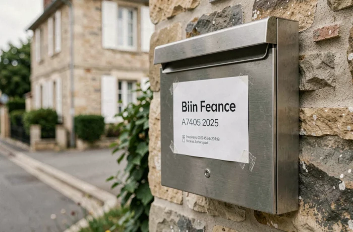
Fonts to Favor for Readability
Sans-serif fonts (Arial, Helvetica, Roboto) provide better rendering on small formats. Decorative or handwritten fonts, appealing on screen, lose clarity when printed small. A simple font ensures that the name remains legible after several months of exposure.
Personalizing Without Compromising Readability
Adding a personal touch is possible within the limits of readability. Online editors like Canva allow you to integrate an icon, a colored border, or a lightly tinted background.
Two precautions to keep in mind: the text-background contrast must remain high (dark text on a light background, or vice versa), and the text area should not be reduced in favor of decorative elements. The last name should occupy at least half of the label’s surface to remain identifiable.
If you wish to add the mention “No advertising,” plan for a second line or a separate label. Compressing too much information into a few centimeters makes the whole confusing.
A well-designed label, printed on suitable material and protected by an adhesive film, serves its purpose for several months without replacement. The mail carrier identifies the recipient, the mail arrives, and the mailbox maintains a neat appearance without spending a dime on an online order.